UX Redesign of an Enterprise Healthcare Procurement Platform
Client
Healthcare client
Year
2026
A major enterprise healthcare client was doing a full frontend rewrite of their spend management platform to apply the design system and meet accessibility compliance. My role was to guide the accessibility and component selection. Beyond that, I identified that several of the most complex flows had UX problems a component swap alone could not fix. I made the case to the PM and product team, they agreed, and the scope expanded to include full UX redesigns. I served as sole designer for one year, delivering three months ahead of schedule.
Scope of Work

Context & Goals
The platform connects two sides of a healthcare procurement process: hospitals that research and request medical products, and manufacturers that list and manage their offerings. Five user types operate across the same screens with different permissions and goals: Hospital User, Hospital Doctor, Hospital Admin, Manufacturer Rep, and Manufacturer Admin.
During the frontend rewrite, I identified that for several complex screens, replacing legacy components with design system equivalents was not enough. The navigation was disorienting not because of missing labels but because the IA itself was not logical. Action flows caused errors not because of missing focus states but because they exposed too many options at once. I brought specific redesign proposals to the PM with before/after comparisons. They were open to many immediately; others they pushed back on due to dev complexity. I found a middle ground for each, prioritizing the highest-impact changes without creating development overload. That negotiation is why the engagement delivered ahead of schedule rather than running over.

Constraints
The design system had never been applied to this platform and was built for clinical tools, not a two-sided procurement experience. Every design decision involved both a UX judgment and a design system question. Designing for five user types on shared screens meant every layout and navigation decision had to work across all five simultaneously. Adapting the desktop-first system for mobile added another layer with no established mobile patterns to reference.
Process
Discovery
I started with a heuristic analysis of the legacy platform, mapping every flow in Figma before touching any design work. Three problem areas emerged: the submission management dashboard lacked hierarchy, the navigation did not reflect how users moved, and the procurement catalog had grown disorganized. Flow-by-flow sessions with the PM followed, to understand how each user type actually used the platform before restructuring anything.

Design and iteration
Each flow followed the same sequence. A PM session paired with Figma Make ideation set the direction, followed by a feasibility review with developers. From there I moved into detailed design in Figma, covering all states and accessibility requirements, then built a Figma Make prototype for developer reference. Each flow closed with a UX team feedback session, where I both presented my own work and gave feedback on others', and a design system review. I served as the accessibility reference for the full design team throughout.
For the most complex procurement catalog flows, I conducted interviews with users and UX researchers to validate direction before committing to detailed design.
Handoff
Before any handoff, I recorded a Loom video of the design decisions for async review, then scheduled a final stakeholder meeting. Each handoff included a precise Figma file with design system specs, accessibility annotations, a Figma Make prototype link, and a feature overview covering current state, problem, and solution. Specs were written with Claude for consistency across 50 flows, and the Figma link was added to the shared developer spreadsheet. After implementation, I ran a demo QA session with stakeholders and the design team.

Key Design Decisions
Submission management dashboard redesign
Three competing zones on the legacy dashboard: a fixed left nav consuming screen width, a bar chart requiring hover to read submission counts, and a financial analytics panel pinned to the right. None communicated at a glance. The bar chart became cards with direct count and label display, resolving an accessibility issue at the same time. The financial analytics panel moved to a dedicated screen. The review progress section, which was static and unclickable, was replaced with a user task list: each user sees their submissions to act on, admins can reassign, notify, and delete. Same screen went from read-only to the primary action surface.


Information architecture
The legacy navigation changed options per section and had financial tools scattered across both sections. I mapped the full navigation in Miro, color-coded by destination, then restructured: left navs became submenus under header options, financial analytics became a standalone header section, account and utility menu options redistributed to match the design system. Navigation that reflected how users actually moved through the product rather than how it had grown historically.

Plan-based access: surfacing limitations without blocking users
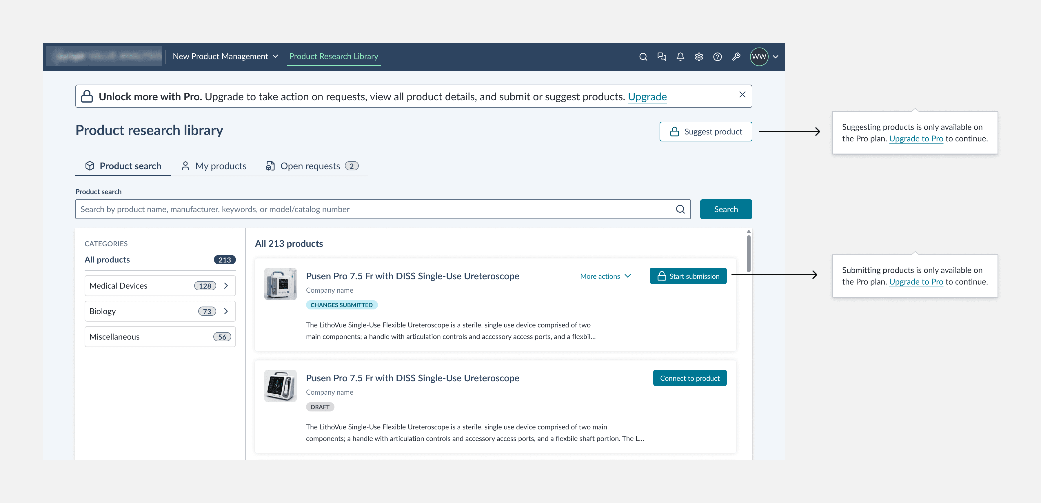
Limited access tier users had no indication upfront that certain actions were unavailable. They would click, go through the motion, and hit a blocking modal alert. A fixed message bar with a lock icon and upgrade CTA now appears for limited access users. Unavailable actions carry the same lock icon. Clicking a locked action opens a subtle, dismissible callout rather than a blocking modal. Informative without being obstructive, accessible without trapping focus. A simultaneous UX and accessibility decision.
Procurement catalog: structure and navigation
The catalog was redesigned entirely: every page, flow, and screen. Left navigation replaced with a tab-based structure and left-hand category filters, closer to how a procurement platform organizes browsing. Primary CTA for requesting or suggesting a product surfaced prominently per user type. Tabs for Favorites and Open Requests give each user only what is relevant. Removing the left nav also simplified keyboard navigation and reduced tab stops: one structural decision, UX and accessibility improved together.


New features: price benchmarking and implementation status
Two new features were identified through user research and requested by the product team, then designed within a single month alongside the broader redesign. Price benchmarking visibility was embedded directly into each product detail view, giving hospital users pricing context at the point of decision without leaving the screen. Implementation status tags were added to each product card, surfacing whether a product is fully approved for use or only partially implemented in the system. Both additions reduce the number of steps a user needs to take to make an informed decision.


Procurement catalog: action flows and progressive disclosure
The legacy platform exposed every action at once regardless of prerequisites. Users clicked, got an error, and had no way to understand why. Replaced with a steppers-based approach: one screen per multi-stage action, surfacing only what the user can do at their current stage. For a Manufacturer Admin, submitting a product follows three steps: product information, pricing, sharing pricing with reps. Each step unlocks only when the previous is complete. Applied across all five user types with their respective action sets. Most screens also designed for mobile; deep management flows remained desktop-only.

Trade-Offs
The design system was built for clinical tools, not a two-sided procurement platform. Repurposing components for interactions they were not designed for required design system team coordination. Some decisions that would have served the experience better were not achievable without new patterns. Consistency across the product suite took priority.
Mobile was deliberately scoped to screens users could realistically access on a phone. Deep multi-step flows stayed desktop-only. Broader mobile coverage would have extended the timeline without proportional value.

Outcomes
First platform in the client's portfolio to achieve a 90+ Level Access accessibility score
Engineering stayed nearly 3 months ahead of expected velocity
50 flows redesigned across five user types over one year as sole designer
Served as the accessibility reference for the full design team throughout the engagement
Recognized at the Concentrix Argentinian Townhall, second half of 2025
WCAG 2.2 compliance embedded from the first frame across every screen and component
Platform is currently in development, with launch expected in 2026. User impact data will follow post-launch.
Reflection
The hardest part was not the volume of work. It was designing one coherent product for five user types who share the same screens but need fundamentally different things from them. Every navigation decision, every action pattern, every page hierarchy had to work for a Hospital Admin managing submissions and a Manufacturer Rep listing products, often in the same view. Getting that right required understanding each user deeply before touching anything in Figma, and holding that understanding across every decision for a year. That is the part of the work that does not show up in the screens but determines whether they work.


