Designing an AI-Powered Music Therapy App for Teen Anxiety Relief
Client
revibe
Year
2021
revibe is a mobile app that combines AI-generated playlists with music therapy to help teenagers manage anxiety. It connects to Spotify, adapting playlist logic to the user's listening history and reported mood, with the therapeutic approach informed by CONICET, Argentina's national scientific research council. I was co-founder and sole designer across eight months, involved in product strategy decisions including the therapeutic framework, the AI brief, and the core product premise.
Scope of Work

Context & Goals
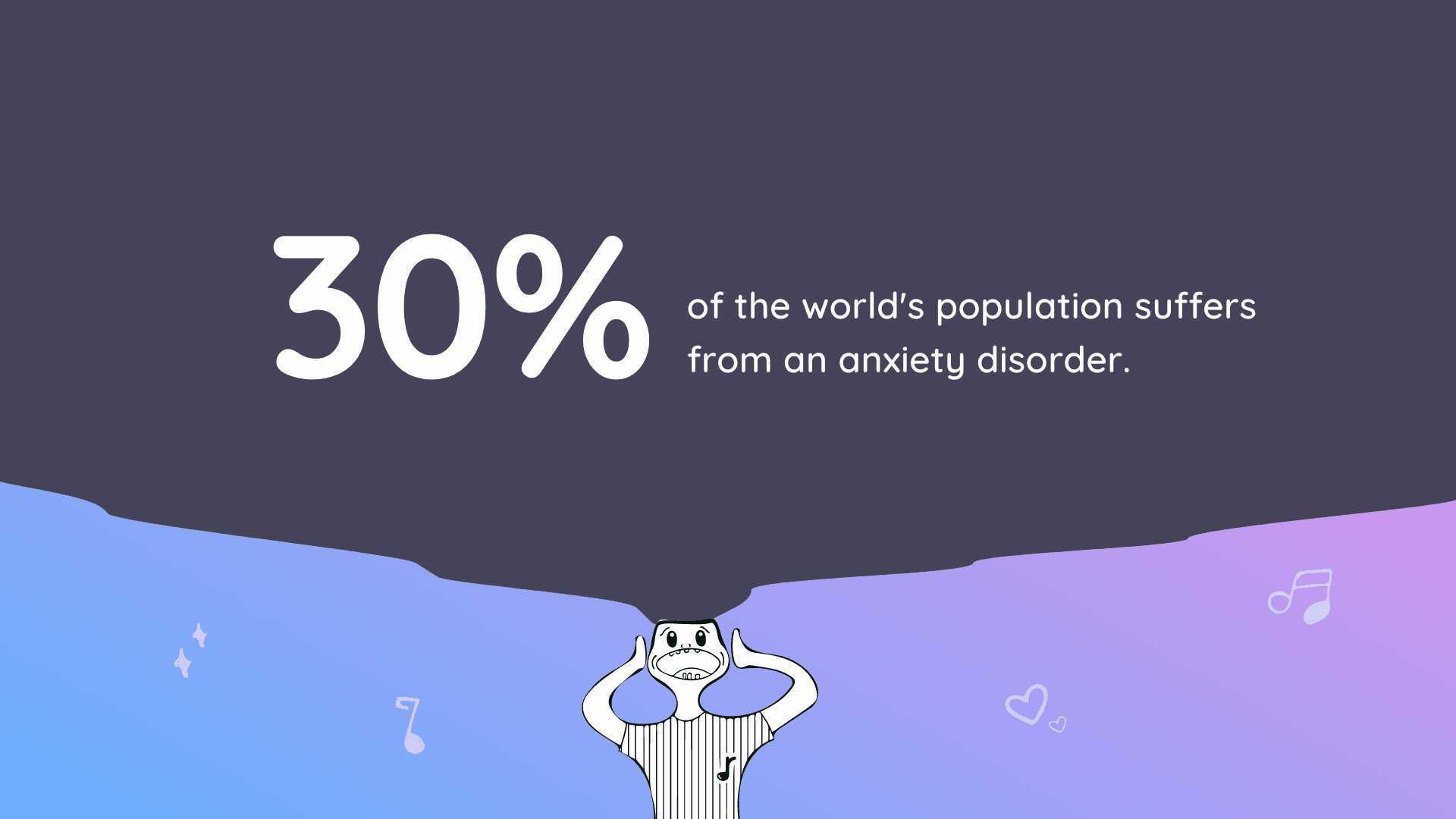
Anxiety in teenagers is one of the most under-served areas in mental health technology. Most existing solutions are either clinical in tone, which creates distance from the people who need them most, or so lightweight that they offer no real therapeutic value. revibe was built on a different premise: that music, already central to teenage life, could be the delivery mechanism for a genuinely therapeutic experience, if the curation was intelligent enough and the design was warm enough to invite real use.
The product generates personalized playlists based on the user's reported mood and listening history, using an AI model trained with music therapy research data sourced from CONICET. The goal was to make the therapeutic layer invisible: users experience it as a music app that understands them, not as a clinical tool they have been prescribed.
Constraints
Designing for teenagers with anxiety required a level of care that went beyond visual preferences. Every interaction had to feel low-pressure: no aggressive onboarding, no heavy data requests upfront, no UI patterns that created friction at moments when a user might already be overwhelmed. The product had to earn trust gradually through the experience itself.
The team was lean and the timeline was eight months from zero to a functional app. Design and development had to move in parallel, which meant making decisions early and holding to them. There was no time for extensive iteration cycles once a direction was committed to.


Research & Direction
User research focused on two distinct areas: understanding how teenagers experience and manage anxiety day to day, and understanding how music therapy works in practice. I developed user personas and mapped user flows around the core moments of anxiety: onset, escalation, and recovery. The playlist generation feature was designed to serve all three, with different content logic applied depending on the mood state the user reported.
The CONICET research data shaped the music therapy framework: which musical characteristics (tempo, key, rhythm) have documented calming effects, and how to sequence a playlist to gradually shift a listener's emotional state rather than just matching it. That framework was the brief the AI team worked from, and it informed which design decisions I could not compromise on: the mood check-in had to be frictionless, and the transition into the playlist experience had to feel immediate.
I developed user personas centered on teenagers navigating anxiety in everyday contexts: before an exam, after a social situation, late at night. The user flow was mapped around those specific moments rather than around abstract feature categories.


Key Design Decisions
Mood-first entry point
The app opens with a mood check-in rather than a home screen. The decision was deliberate: getting the user's current state before anything else means the first thing the app does is respond to how they actually feel, not present them with a generic interface they have to navigate. The check-in was designed to be as low-friction as possible, a single interaction that moves immediately into playlist generation.

Color psychology as a functional system
The color palette was not decorative. Each mood state in the app maps to a distinct color range, with calming tones anchored in muted blues and purples and more energizing states using warmer hues. The transitions between states use those colors to signal a shift in the experience before the music does. For users who may be anxious or overwhelmed, visual consistency and color logic provide an additional layer of orientation.

Motion design as reassurance
I designed the loading and playlist generation animations in Rive and Lottie specifically to reframe waiting as part of the experience. A teenager waiting for a playlist while anxious is in a vulnerable moment. The animations were designed to feel alive and responsive rather than mechanical: the generation progress animation responds to input and feels organic, not like a progress bar. The goal was for the wait to feel like something was being made for you, not something being processed.
Brand identity built for trust
The brand had to feel warm and personal without tipping into the clinical aesthetic of mental health products or the high-energy aesthetic of music apps. The logo connects the letter R with a musical note, tying the product name directly to its core function. Illustrations use a hand-drawn style rather than polished vector work, giving the product a human, unguarded quality that feels less like a clinical interface and more like something made with care. Approachable but not childish. Calm but not sterile

Trade-Offs
The app shipped as a fully functional product but did not go to market. Without a user base, there is no behavioral data to validate the design decisions made around mood check-in flow, playlist transition, or animation timing. Those decisions were grounded in the CONICET research framework and in research conducted during the design process, but real-world validation remains the next step.
The motion design scope was intentionally contained to the two highest-stakes moments in the experience: the loading state and the playlist generation. A fuller motion system across the entire app would have improved the overall feel but was not achievable within the eight-month timeline without compromising the core product.

Outcomes
Fully functional app shipped across the eight-month development cycle
Music therapy approach informed by CONICET research data
Sole designer across product design, motion design, brand identity, and illustration
Playlist generation and loading animations built in Rive and Lottie
User flow and information architecture designed around the specific anxiety contexts of teenage users
Presented at a public pitch competition to 100+ people including CONICET researchers, receiving one of the highest scores among all competing projects
Reflection
What this project taught me is how much design decisions carry when the user is vulnerable. Every friction point in a mental health product is not just a usability problem: it is a moment where someone who already needed help might stop. That raised the stakes on every decision, from the mood check-in to the animation timing to the color of a button. Designing for anxiety is designing for the worst moment in a user's day, and that changes what good design looks like.


