Platform Redesign and Brand Design for Leading AI Wildfire Detection Startup
Client
Satellites on Fire
Year
2022
Satellites on Fire is a climate-tech startup that detects wildfires faster than NASA's system using AI, satellite imagery, and real-time alerts. The platform serves forestry companies, energy utilities, insurers, and governments across 21 countries, and is being integrated into AON's forestry insurance policies across Latin America. The company has since raised a $2.7 million seed round led by Dalus Capital with participation from Draper Associates and Draper Cygnus. I joined as sole designer for four months to redesign the web app and landing page, and to build the brand from scratch: logo, visual identity, and social media, working within Material Design 3 alongside the engineering team.
Scope of Work

Context & Goals
The platform had already achieved meaningful adoption: approval from the National Argentine Firefighters Council across 180 organizations, and clients spanning forestry, agriculture, energy, insurance, and government. The problem was that the existing UI created friction at exactly the wrong moment. Wildfire detection is time-critical, and a confusing interface is not just a usability issue, it is an operational risk. The brief was a cleaner information architecture, a scalable component foundation, and a visual language that matched the seriousness of what the product was doing.

Constraints
The redesign had to be built on Material Design 3, which the engineering team was already working within. Decisions were about how to configure, extend, and apply the system to a wildfire monitoring context, not about establishing one from scratch. The platform is used by forestry operators and emergency responders with no time to hunt for information, so speed of comprehension and clarity of action took priority over visual novelty.
Research & Direction
I started with a competitive analysis of monitoring platforms. It surfaced a clear pattern: high-contrast data, minimal navigation, alert hierarchies that make critical information impossible to miss. The existing SoF platform had the right data but required too much interpretation. I worked from one question: what does a user need to know within the first ten seconds? That restructured the IA, putting alerts at the top and everything else behind it. The sequence was brand first, then the web app, then the landing page, with the CEO and engineering team, who had daily contact with operators and responders, as the primary research channel.
One early direction was bolder and more colorful, closer to what the CEO wanted for investor appeal. I made the case against it: a platform used by responders needs authority at a glance, and a restrained system reads as more credible to investors than a bold one. The CEO agreed, and that functional system carried across the platform and the landing page.

Key Design Decisions
Alert-first information hierarchy
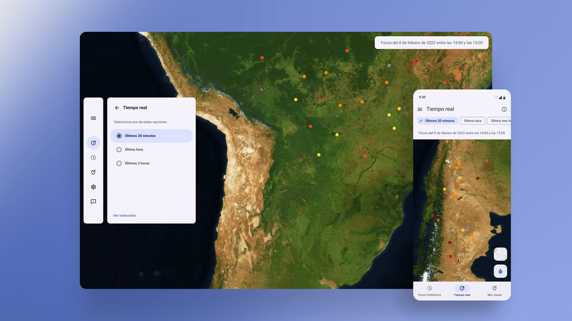
The most important thing a wildfire platform can tell you is whether something is happening right now. The redesigned interface puts active alerts at the top of the visual hierarchy on every relevant screen, with a clear severity system that does not require a legend to read. Users land on the platform and immediately know whether they need to act.

Material Design 3 applied to a high-stakes context
Material Design 3 is built for consumer products. Applying it to an emergency monitoring platform required deliberate decisions about which patterns to keep, which to override, and where the system needed extension. I built a component library within the Material 3 framework that adapted the defaults: higher contrast ratios, a more restrained use of color to preserve the signal value of alert states, and typography scaled for readability on large monitoring screens as well as mobile.

Landing page as a credibility document
The landing page serves a different audience than the platform: enterprise clients, government partners, and investors. It was structured around proof points: detection speed relative to existing systems, geographic coverage, and existing client categories. Coming last in the sequence, it carried the same visual language established for the web app, giving both surfaces a coherent brand presence from launch.
Logo and brand identity
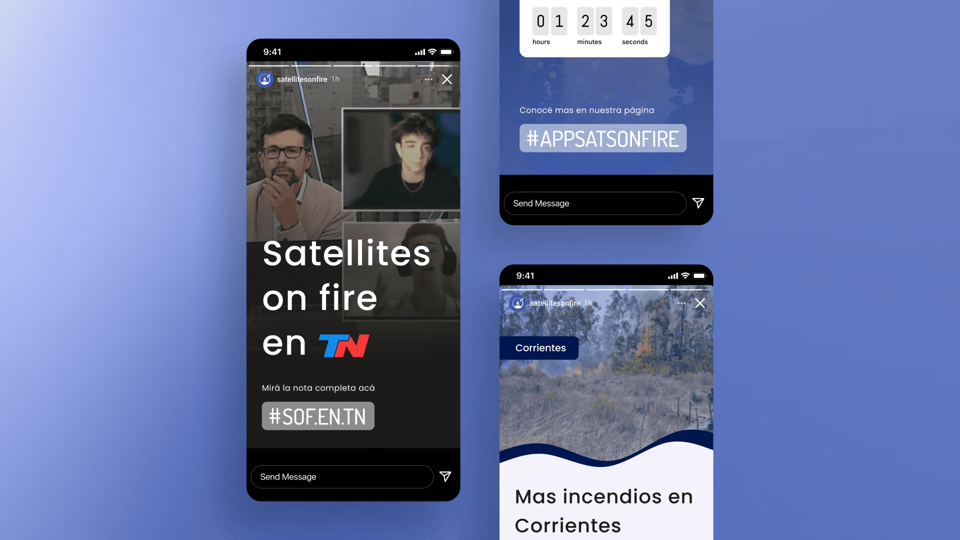
No logo, no palette, no visual language existed. The mark combines a satellite and a tree orbiting the globe, a spatial representation of the product's core promise: global coverage protecting what is on the ground. Typography is drawn from Material's system but kept structured and clean, prioritizing legibility in hard-use field conditions over personality. The color is a deep marine blue, chosen for what it signals rather than how it looks: confidence and security, the same association water carries as a symbol of safety. The identity had to read clearly at icon size on a dashboard under operational pressure, and command authority at large scale in a pitch deck. The social media system extended the same visual language into templates for press interviews, feature announcements, and general brand presence across channels from day one.

Trade-Offs
Working within MD3 kept the process moving efficiently but set a ceiling on how distinctive the visual language could be. Some decisions that would have given the platform a stronger individual identity were not achievable within the system and timeline. A standard system developers can build from confidently is more valuable in a fast-moving startup than a bespoke design that creates implementation uncertainty.
Direct user interviews were not part of this engagement. The team served as the primary proxy for user knowledge, which worked within the four-month timeline but meant decisions were validated through internal review rather than with operators under real conditions. With more time, direct end-user research would have been the right approach.
The social media and brand assets were scoped to immediate needs. A fuller system covering motion, data visualization standards, and presentation templates is the natural next step as the company grows.
Outcomes
Web app and landing page redesigned, logo and brand identity built from scratch, in four months as sole designer
Positively received by users across firefighter and emergency response organizations following the redesign
Platform now serves 55,000+ users across 21 countries and 4 continents
$2.7 million seed round raised since the redesign, led by Dalus Capital
Product integrated into AON's forestry insurance policies across Latin America
600+ wildfires responded to in 2025, averaging 95 fires assisted per month
Redesigned web app platform structure has remained in production for over five years with no structural changes

Reflection
What I find most interesting about this project is the relationship between design clarity and real-world consequence. On most products, a confusing interface means a frustrated user. On a wildfire detection platform, it means a slower response to an active fire. That raised the standard for every decision: not just whether something was usable, but whether it was fast enough, clear enough, and reliable enough to trust under pressure. That is a different kind of design problem, and the kind I find most worth taking seriously.


