Building a Web Presence for Argentina's Top Color Grading Studio
Client
Momotombo Color
Year
2025
Momotombo Color is one of Argentina's top color grading studios, with credits on awarded films, series, and music videos for Wiz Khalifa, Bizarrap, Duki, and Rauw Alejandro, and long-standing relationships with Landia, Anestesia, Arena Collective, Bunker, and Kuarzo Entertainment. No website, no logo, no visual identity. I worked with the founder and post-production coordinator over four weeks as sole designer, building the brand and site from scratch in Framer.
Scope of Work
Context & Goals
A studio with clients like Landia and Kuarzo Entertainment had Instagram as its only professional touchpoint. For a boutique studio at this level, that gap matters: a production company director who cannot find a proper website often moves on before making contact. The goal was a site that matched the seriousness of the work and gave the studio a professional home that Instagram structurally cannot be.

Constraints
No existing brand to build from: no logo, no color palette, no typography, no visual language. Identity and site design had to run in parallel across four weeks. Framer handled brand, CMS, responsive design, and development in one tool, the only way to deliver the full scope without a separate developer. Full responsiveness across desktop, tablet, and mobile added layout complexity given the heavy use of full-bleed video and large background frames.
Research & Direction
With few color grading studio references available, I looked at creative studio portfolios, post-production company sites, and editorial photography portfolios where presenting still work with emotional weight had already been solved. The founder and post-production coordinator were the primary research source: they knew exactly what questions potential clients asked and what the studio needed to communicate to earn a serious conversation. The design process was iterative throughout: screens and identity elements were shared as they developed, with feedback from the team shaping decisions continuously rather than through formal review stages.
Two directions were explored and discarded. A fully dark site felt monotonous: without lighter sections to create contrast, every section blended into the next and the work lost its impact. A stripped two-page site left too many client questions unanswered: a director who cannot find who they would be working with, or what the process looks like, often does not reach out. The final direction was minimal and dark with white sections handling context and credibility.


Key Design Decisions
Brand identity
With no visual language to build from, every decision was made from scratch. The logo is minimal and structured, set in Inter to match the site's typography system. Page titles use Playfair Display italic for the last word, adding personality and a more editorial register without breaking the overall restraint. The word "Color" in the hero and footer carries a subtle rainbow gradient across each letter: a deliberate reference to the studio's craft that adds warmth without being decorative for its own sake. The identity is built to stay out of the way of the work while still having something to say.

Full-bleed video hero
Color grading lives in motion. A static hero image on a color grading site is a contradiction. The decision to open with a full-bleed looping reel was the highest-leverage call in the project: quality and range communicated within two seconds, nothing competing for attention. Enough to prove the craft, not so much that the site becomes a showreel with no identity behind it.
Project frames as background textures
Using actual project frames as large background elements extended the presence of the work beyond the portfolio grid and gave each section its own atmosphere. The studio's range across genres becomes visible in the texture of the site itself, not only in the portfolio.
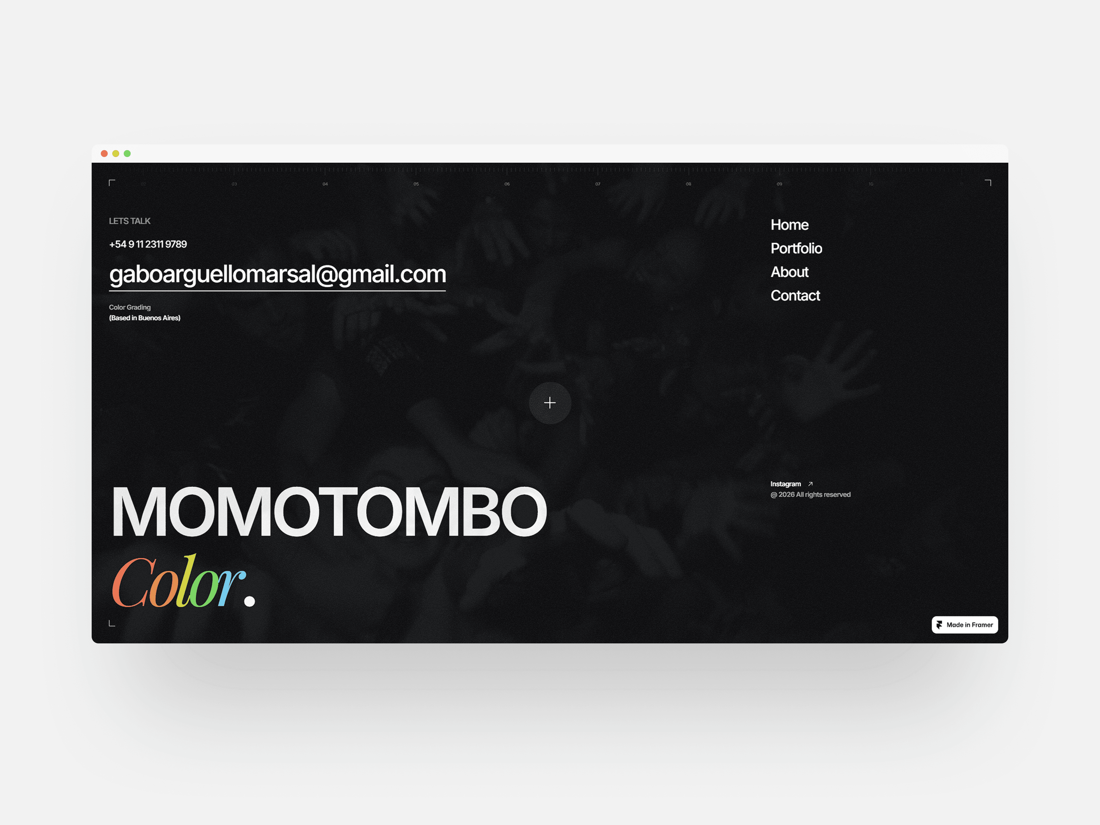
Mixed dark and light system
A fully dark site would have flattened the experience. Dark sections showcase footage at full visual weight. White sections handle context and credibility: clients, team, philosophy. The contrast between them creates rhythm and makes each section feel intentional rather than repetitive.


Navigation limited to three items
Portfolio, About, and Contact. No services page, no pricing. Clients who reach out to a studio at this level already know what color grading is. A services breakdown shifts the tone from confident craft studio to vendor, and published pricing anchors conversations in cost before any creative discussion happens.

FAQ on the homepage
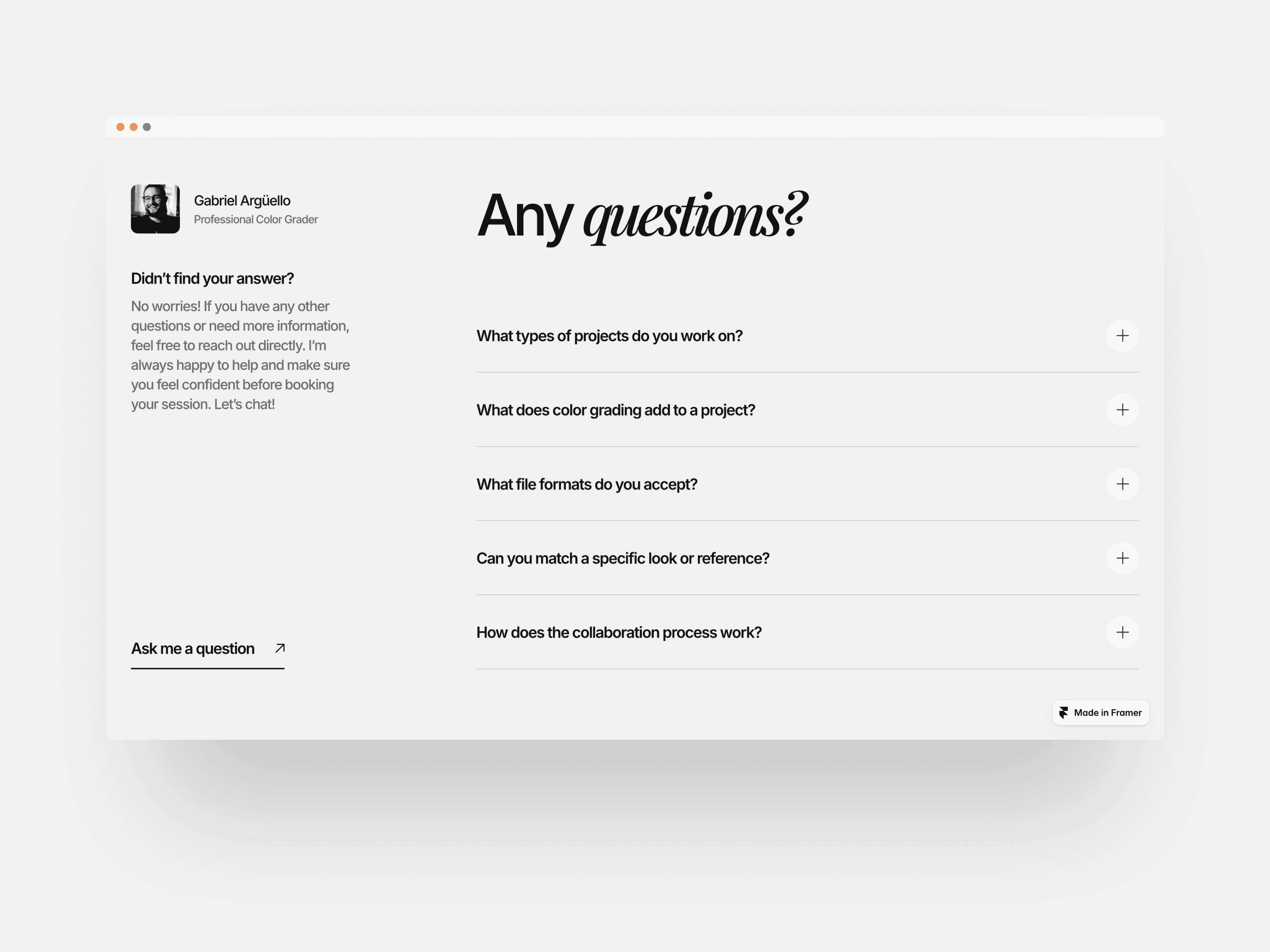
A director visiting for the first time has questions: who are these people, what is the process, are they available. If those go unanswered they leave. Embedding the FAQ on the homepage keeps the answers one scroll away without requiring an extra page or a back-and-forth email to start a conversation.
Curated project index over a gallery grid
A masonry grid would have made the portfolio feel like a showreel dump with no editorial voice. Each project gets a format label and year instead, giving a visiting director immediate context about the type of work and its recency without clicking. Powered by Framer CMS so the team updates entries independently.
SEO optimization
Starting from zero web presence means starting from zero search visibility. Built with semantic structure and descriptive metadata from day one. A director searching for who graded a specific Bizarrap video should be able to find Momotombo. A site that cannot be found by the right people is not doing its job regardless of how well it looks.
Trade-Offs
Project pages are primarily visual: stills, video, and a title. Adding written context to each project would have given directors more background on the creative choices behind a specific grade. That was a proactive decision: for a color grading studio, a frame is more convincing than words. The pages stay clean and let the visual work carry the argument.
The brand identity was scoped to site needs. A fuller system covering motion, social, and print would have required more time and budget than the engagement allowed. The identity delivered is solid and extensible, and a fuller system is the clear next step.

Outcomes
Website live at momotombo.framer.website, replacing Instagram as the studio's primary professional touchpoint
Fully responsive across desktop, tablet, and mobile
Dynamic CMS for the project portfolio, allowing the team to add and update entries independently
SEO optimized across all pages with semantic structure and descriptive metadata
Designed and built end-to-end in four weeks as sole designer
Covers the full scope: brand identity, web design, responsive design, CMS integration, SEO, and Framer development
Reflection
What I find most interesting about this project is that it started with nothing and needed to feel like it had always existed. No brand, no references, no prior identity, just world-class work and an Instagram page. The challenge was building something that felt inevitable rather than assembled, and closing that gap between the level of their craft and the presence they had. The final result reflects that.


