Building a Web Presence for One of Argentina's Most Versatile Creative Studios
Client
Perra Negra Films
Year
2025
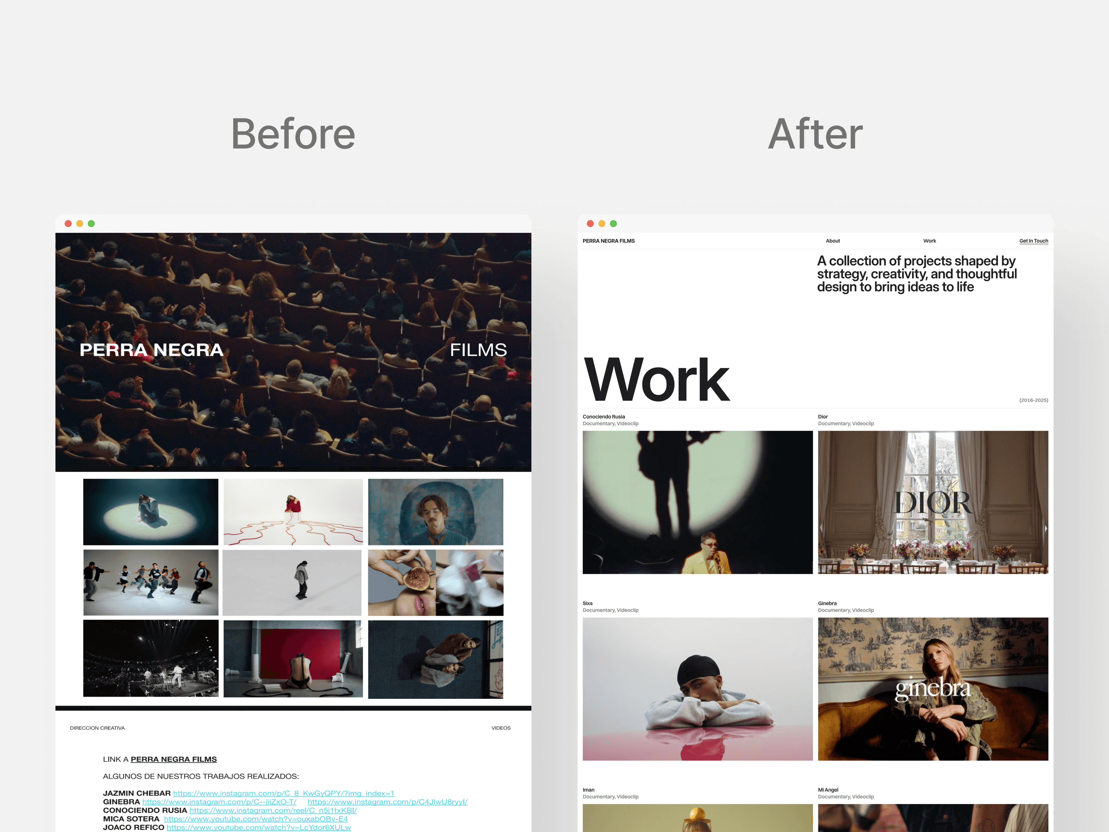
Perra Negra Films is a Buenos Aires-based creative studio with a portfolio that spans music videos, fashion films, and commercial campaigns for clients including Dior, Jazmin Chebar, Ginebra, Mercado Libre, and artists including Conociendo Rusia. The studio had no website, no logo, and no visual identity. I worked directly with the two founders over three weeks as sole designer, building the brand and the site from scratch in Framer.
Scope of Work
Context & Goals
Perra Negra is not a specialist studio. They direct music videos for Conociendo Rusia, fashion films for Dior and Jazmin Chebar, and commercial campaigns for Mercado Libre. That range is what makes them interesting and what made the design problem hard: a studio that does one thing well can build an identity around that one thing. A studio that does many things well needs an identity strong enough to hold all of them without flattening any of them.
Their only professional touchpoints were Instagram and a PDF portfolio. For a studio pitching to brands like Dior and Mercado Libre, that gap was becoming harder to ignore.
Constraints
No existing brand to build from: no logo, no color palette, no typography, no visual language. Identity and site design had to run in parallel across three weeks, with every visual decision being made for the first time. Framer handled brand, CMS, responsive design, and development in one tool without needing a developer.
Research & Direction
Most studio sites fall into two traps: leading with a showreel that gives no sense of the studio's thinking, or over-branding to the point where the work feels secondary. I looked at director representation sites and independent production company portfolios, studying how the best ones created a distinct editorial voice without overshadowing what they were selling.
The founders were the primary research source. Mica and Gianna knew exactly what questions clients asked and what the studio needed to communicate to a brand director seeing it for the first time. Those conversations shaped the structure as much as the visual references. The design process was iterative throughout: screens and identity elements were shared as they developed, with feedback from the founders shaping decisions continuously rather than through formal review stages.
Two directions were discarded. A fully editorial approach felt disconnected from the raw energy of the music video work. A dark, cinematic direction worked for music video projects but felt wrong for fashion and commercial work that needed air and light. The direction that held was a high-contrast system that could shift tone depending on the content. Site copy was written with AI to keep the voice consistent within the three-week timeline.

Key Design Decisions
High-contrast visual identity
The identity had to serve a wide range of work with no existing brand to build from. The logo is the studio name set in Switzer, a geometric sans-serif that reads with authority across both fashion and music video contexts. The same typeface carries through the site, creating a consistent typographic system that holds the range of the work without favoring any one genre. Stark typography against black, a restrained palette that steps back when work is present, and a layout that accommodates both the intimacy of a fashion film and the scale of a concert production. The brand frames the work rather than competing with it.

Full-bleed video hero
A creative studio lives in motion. The homepage opens with a full-bleed looping reel, nothing competing for attention. A Dior fashion film and a Conociendo Rusia music video feel completely different, but playing back to back in a full-bleed hero they establish the studio's range in a way no written description could.
CMS-powered project index
The portfolio is powered by Framer CMS so the founders update entries without touching design or code. A creative studio adds new projects regularly and a static site would require a designer every time. Each entry carries a format label and client name, giving visitors immediate context without a click.
Navigation limited to four items
Navigation kept minimal
Portfolio, About, and Contact. No services page, no pricing. A brand like Dior reaching out already knows what they need. A services page shifts the tone from creative partner to vendor, and published pricing anchors conversations in cost before any creative discussion happens.

SEO optimization
Starting from zero web presence means starting from zero search visibility. Semantic structure, descriptive metadata, and optimized page titles from the first build. For a studio whose clients include brand directors searching for specific production work, being findable matters as much as the visual design.
Trade-Offs
Project pages are primarily visual: footage, stills, and a title. For a creative studio the work makes the argument on its own terms. Adding written context to every project risks making the site feel like a case study archive rather than a studio portfolio.
The brand identity was scoped to site needs. A fuller system covering social, motion, and print would have required a separate brief. Three weeks in parallel left no room for it. Deliberate scope decision, not an oversight.

Outcomes
Website live at perranegra.framer.website, replacing Instagram and a PDF as the studio's primary professional touchpoint
Founders reported a significant increase in contact and client inquiries following launch
Fully responsive across desktop, tablet, and mobile
Dynamic CMS for the project portfolio, allowing the founders to add and update entries independently
SEO optimized across all pages with semantic structure and descriptive metadata
Designed and built end-to-end in three weeks as sole designer
Reflection
What I find most interesting about this project is the range problem. Momotombo is a specialist studio: every project looks like Momotombo. Perra Negra is the opposite. A Dior fashion film and a Conociendo Rusia music video are completely different objects. The challenge was building a brand and a site that could hold all of that without flattening it, and without the identity getting in the way of the work. Getting that balance right in three weeks, from zero, is what this project is really about.

